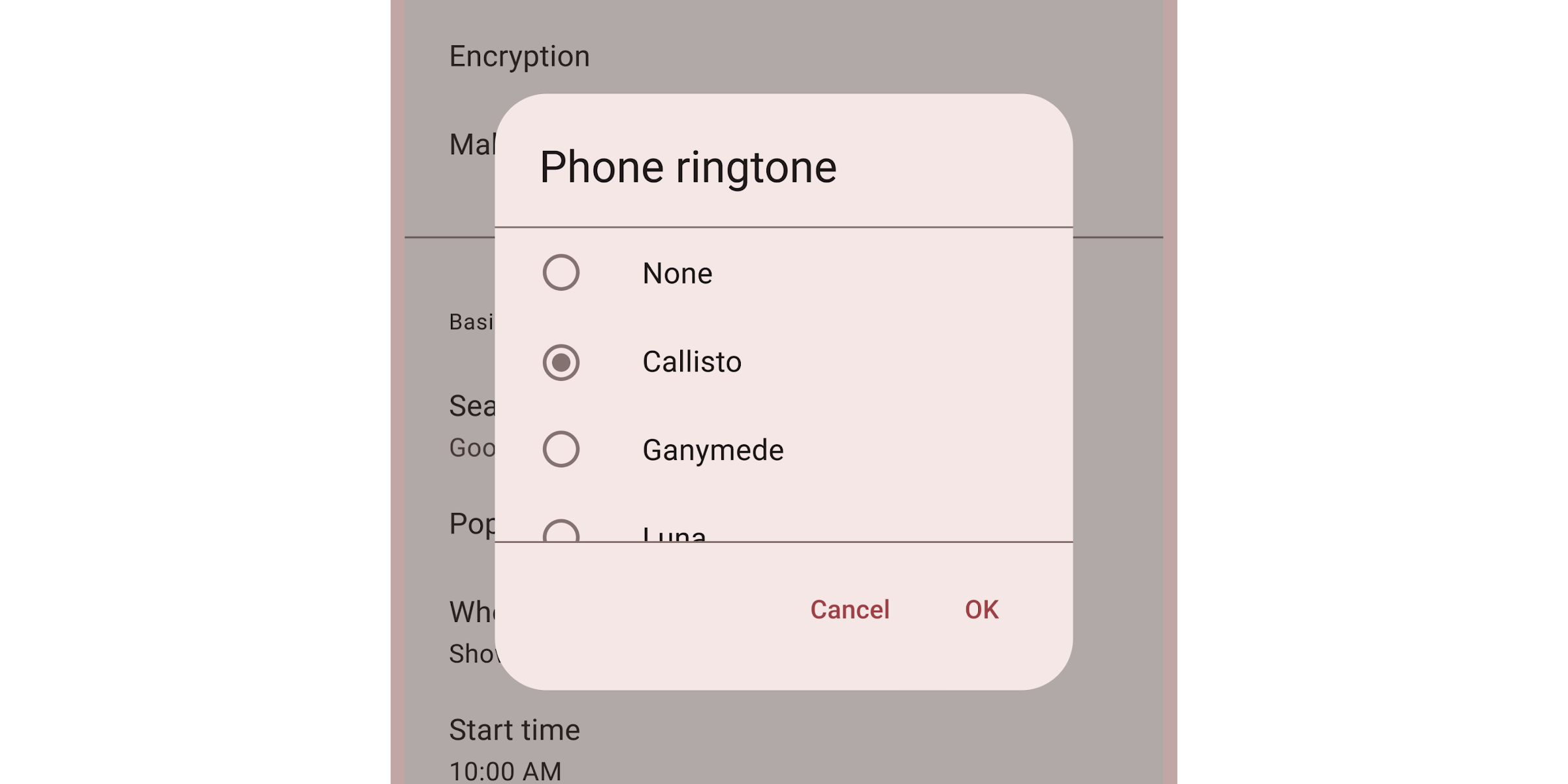
Dialogs
Dialogs provide important prompts in a user flow.

Interactive Demo
Link to “Interactive Demo”View interactive demo inline.
Open interactive demo in new tab.
Usage
Link to “Usage”Dialogs behave like <dialog> elements, and can be closed with a <form method="dialog"> element.
Dialogs have three optional sections: the headline title, the main content, and action buttons.
<md-dialog>
  <div slot="headline">
    Dialog title
  </div>
  <form slot="content" id="form-id" method="dialog">
    A simple dialog with free-form content.
  </form>
  <div slot="actions">
    <md-text-button form="form-id">Ok</md-text-button>
  </div>
</md-dialog>
star use margin, height, and width CSS properties to control the dialog's size and position.
Opening and closing
Link to “Opening and closing”Dialogs are opened and closed by setting the open attribute or property.
<md-dialog open>
  <div slot="content">
    A dialog that is opened by default.
  </div>
</md-dialog>
Dialogs are also opened and closed by calling dialog.show() and dialog.close().
Both return a Promise that resolves after the dialog's animation finishes.
closeButton.addEventListener('click', async () => {
  await dialog.close();
});
Return value
Link to “Return value”A button's value attribute will set the dialog's returnValue property to identify which button closed it.
<md-dialog open>
  <form slot="content" id="form-id" method="dialog">...</form>
  <div slot="actions">
    <md-text-button form="form-id" value="cancel">Cancel</md-text-button>
    <md-text-button form="form-id" value="ok">Ok</md-text-button>
  </div>
</md-dialog>dialog.addEventListener('close', () => {
const cancelClicked = dialog.returnValue === 'cancel';
const okClicked = dialog.returnValue === 'ok';
});Accessibility
Link to “Accessibility”Dialogs are labelled by their headlines. Add an aria-label attribute to dialogs without a headline.
<md-dialog aria-label="Error message">
  <div slot="content">An error occurred, details ...</div>
</md-dialog>
Alerts
Link to “Alerts”Add a type="alert" attribute to dialogs that need to communicate an important message and require a user's response.
Common examples include error messages that require confirmation and other action confirmation prompts.
<md-dialog type="alert">
  <div slot="headline">Confirm deletion</div>
  <form slot="content" id="form-id" method="dialog">
    Are you sure you wish to delete this item?
  </form>
  <div slot="actions">
    <md-text-button form="form-id" value="cancel">Cancel</md-text-button>
    <md-text-button form="form-id" value="delete">Delete</md-text-button>
  </div>
</md-dialog>
Theming
Link to “Theming”Dialogs supports Material theming and can be customized in terms of color, typography, and shape.
Tokens
Link to “Tokens”| Token | Default value |
|---|---|
--md-dialog-container-color | --md-sys-color-surface-container-high |
--md-dialog-headline-color | --md-sys-color-on-surface |
--md-dialog-headline-font | --md-sys-typescale-headline-small-font |
--md-dialog-supporting-text-color | --md-sys-color-on-surface-variant |
--md-dialog-supporting-text-font | --md-sys-typescale-body-medium-font |
Example
Link to “Example”<style>
:root {
/* System tokens */
--md-sys-color-surface-container-highest: #dde4e3;
--md-sys-color-on-surface: #161d1d;
--md-sys-color-on-surface-variant: #3f4948;
--md-sys-typescale-body-medium: system-ui 16px/24px;
--md-sys-typescale-headline-small: system-ui 24px/32px;
/* Component tokens */
--md-dialog-container-shape: 0px;
}
</style>
<md-dialog>
<div slot="headline">Title</div>
<div slot="content">Dialog content</div>
</md-dialog>MdDialog <md-dialog>
Link to “MdDialog <md-dialog>” Properties
Link to “Properties”| Property | Attribute | Type | Default | Description |
|---|---|---|---|---|
returnValue | string | '' | Gets or sets the dialog's return value, usually to indicate which button a user pressed to close it. https://developer.mozilla.org/en-US/docs/Web/API/HTMLDialogElement/returnValue | |
type | type | string | undefined | The type of dialog for accessibility. Set this to alert to announce a dialog as an alert dialog. |
open | open | boolean | undefined | |
getOpenAnimation | () => DialogAnimation | function { ... } | Gets the opening animation for a dialog. Set to a new function to customize the animation. | |
getCloseAnimation | () => DialogAnimation | function { ... } | Gets the closing animation for a dialog. Set to a new function to customize the animation. |
Methods
Link to “Methods”| Method | Parameters | Returns | Description |
|---|---|---|---|
show | None | Promise<void> | Opens the dialog and fires a cancelable open event. After a dialog's animation, an opened event is fired.Add an autocomplete attribute to a child of the dialog that should receive focus after opening. |
close | returnValue | Promise<void> | Closes the dialog and fires a cancelable close event. After a dialog's animation, a closed event is fired. |
Events
Link to “Events”| Event | Description |
|---|---|
open | Dispatched when the dialog is opening before any animations. |
opened | Dispatched when the dialog has opened after any animations. |
close | Dispatched when the dialog is closing before any animations. |
closed | Dispatched when the dialog has closed after any animations. |
cancel | Dispatched when the dialog has been canceled by clicking on the scrim or pressing Escape. |