Sliders
Sliders allow users to view and select a value (or range) along a track. They're ideal for adjusting settings such as volume and brightness, or for applying image filters.
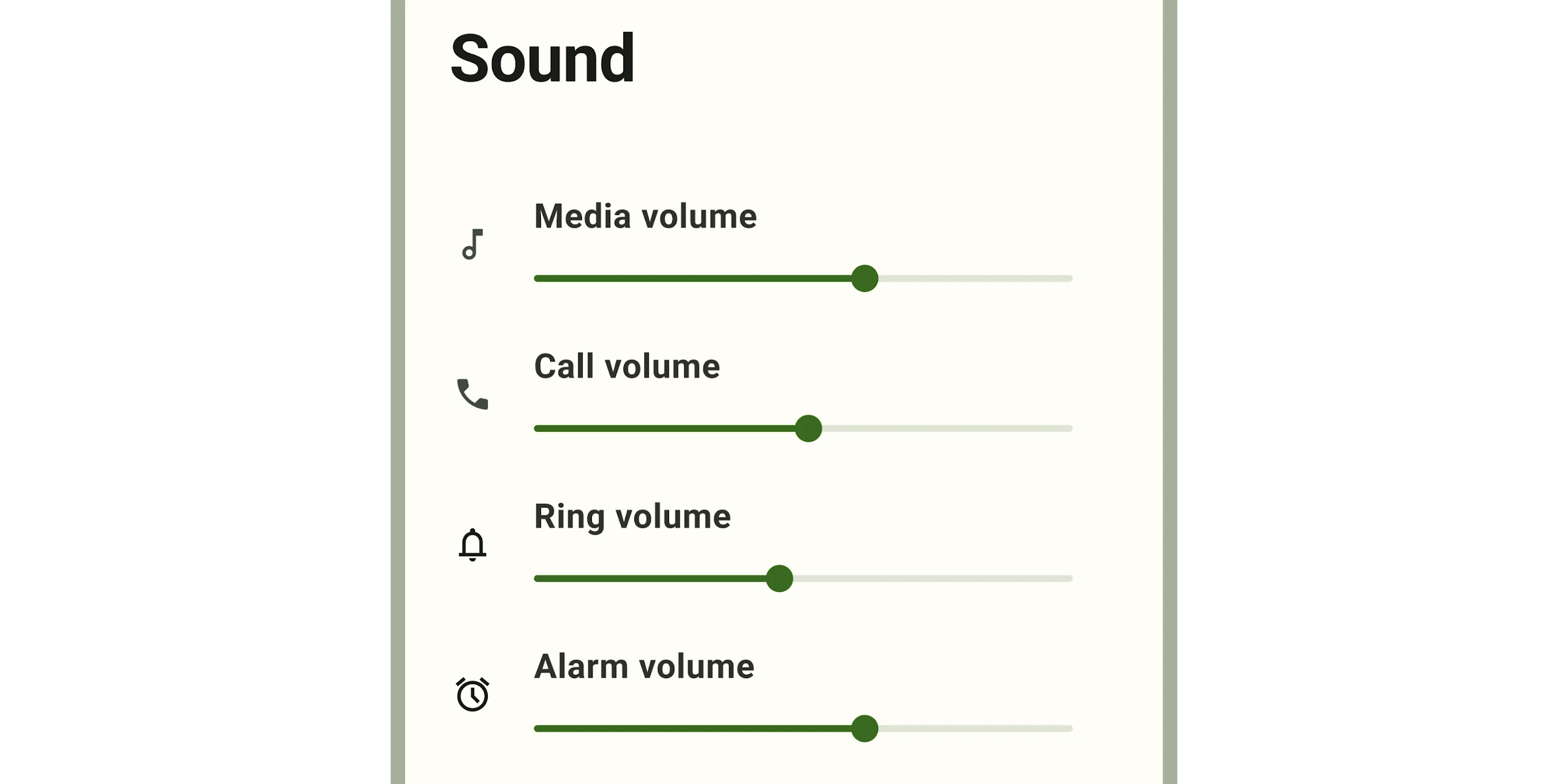
Sliders can use icons or labels to represent a numeric or relative scale.
Interactive Demo
Link to “Interactive Demo”View interactive demo inline.
Open interactive demo in new tab.
Usage
Link to “Usage”Sliders may be continuous or discrete, and may also represent a range.
<md-slider></md-slider>
<md-slider ticks value="50"></md-slider>
<md-slider range value-start="25" value-end="75"></md-slider>
Continuous
Link to “Continuous”Allows users to select a value along a subjective range.
<md-slider min="0" max="100" value="50"></md-slider>Discrete
Link to “Discrete”Allows users to select a specific value from a predetermined range. Tick marks may be used to indicate available values.
<md-slider step="5" ticks min="0" max="20"></md-slider>Range
Link to “Range”A range slider has two handles, and indicates a minimum and maximum value in a range.
<md-slider range value-start="25" value-end="50"></md-slider>Value label
Link to “Value label”A value label displays the specific value that corresponds with the handle's placement.
The label appears when the handle is selected. For range sliders, labels appear when either handle is selected.
<md-slider labeled></md-slider>Theming
Link to “Theming”Slider supports Material theming and can be customized in terms of color and shape.
Tokens
Link to “Tokens”| Token | Default value |
|---|---|
--md-slider-active-track-color | --md-sys-color-primary |
--md-slider-active-track-shape | --md-sys-shape-corner-full |
--md-slider-inactive-track-color | --md-sys-color-surface-container-highest |
--md-slider-inactive-track-shape | --md-sys-shape-corner-full |
--md-slider-handle-color | --md-sys-color-primary |
--md-slider-handle-shape | --md-sys-shape-corner-full |
Example
Link to “Example”<style>
:root {
/* System tokens */
--md-sys-color-primary: #006A6A;
/* Component tokens */
--md-slider-handle-shape: 0px;
}
</style>
<md-slider
range
value-start="25"
value-end="75"
ticks
step="5"
></md-slider>MdSlider <md-slider>
Link to “MdSlider <md-slider>” Properties
Link to “Properties”| Property | Attribute | Type | Default | Description |
|---|---|---|---|---|
min | min | number | 0 | The slider minimum value |
max | max | number | 100 | The slider maximum value |
value | value | number | undefined | The slider value displayed when range is false. |
valueStart | value-start | number | undefined | The slider start value displayed when range is true. |
valueEnd | value-end | number | undefined | The slider end value displayed when range is true. |
valueLabel | value-label | string | '' | An optional label for the slider's value displayed when range is false; if not set, the label is the value itself. |
valueLabelStart | value-label-start | string | '' | An optional label for the slider's start value displayed when range is true; if not set, the label is the valueStart itself. |
valueLabelEnd | value-label-end | string | '' | An optional label for the slider's end value displayed when range is true; if not set, the label is the valueEnd itself. |
ariaLabelStart | aria-label-start | string | '' | Aria label for the slider's start handle displayed when range is true. |
ariaValueTextStart | aria-valuetext-start | string | '' | Aria value text for the slider's start value displayed when range is true. |
ariaLabelEnd | aria-label-end | string | '' | Aria label for the slider's end handle displayed when range is true. |
ariaValueTextEnd | aria-valuetext-end | string | '' | Aria value text for the slider's end value displayed when range is true. |
step | step | number | 1 | The step between values. |
ticks | ticks | boolean | false | Whether or not to show tick marks. |
labeled | labeled | boolean | false | Whether or not to show a value label when activated. |
range | range | boolean | false | Whether or not to show a value range. When false, the slider displays a slideable handle for the value property; when true, it displays slideable handles for the valueStart and valueEnd properties. |
disabled | boolean | undefined | ||
name | string | undefined | ||
nameStart | string | undefined | ||
nameEnd | string | undefined |
Methods
Link to “Methods”| Method | Parameters | Returns | Description |
|---|---|---|---|
formResetCallback | None | void | |
formStateRestoreCallback | state | void |
Events
Link to “Events”| Event | Type | Bubbles | Composed | Description |
|---|---|---|---|---|
change | Event | Yes | No | The native change event on <input> |
input | InputEvent | Yes | Yes | The native input event on <input> |