Tabs
Tabs organize groups of related content that are at the same level of hierarchy.
Types
Link to “Types”Interactive Demo
Link to “Interactive Demo”View interactive demo inline.
Open interactive demo in new tab.
Usage
Link to “Usage”Tabs contain multiple primary or secondary tab children. Use the same type of tab in a tab bar.
<md-tabs>
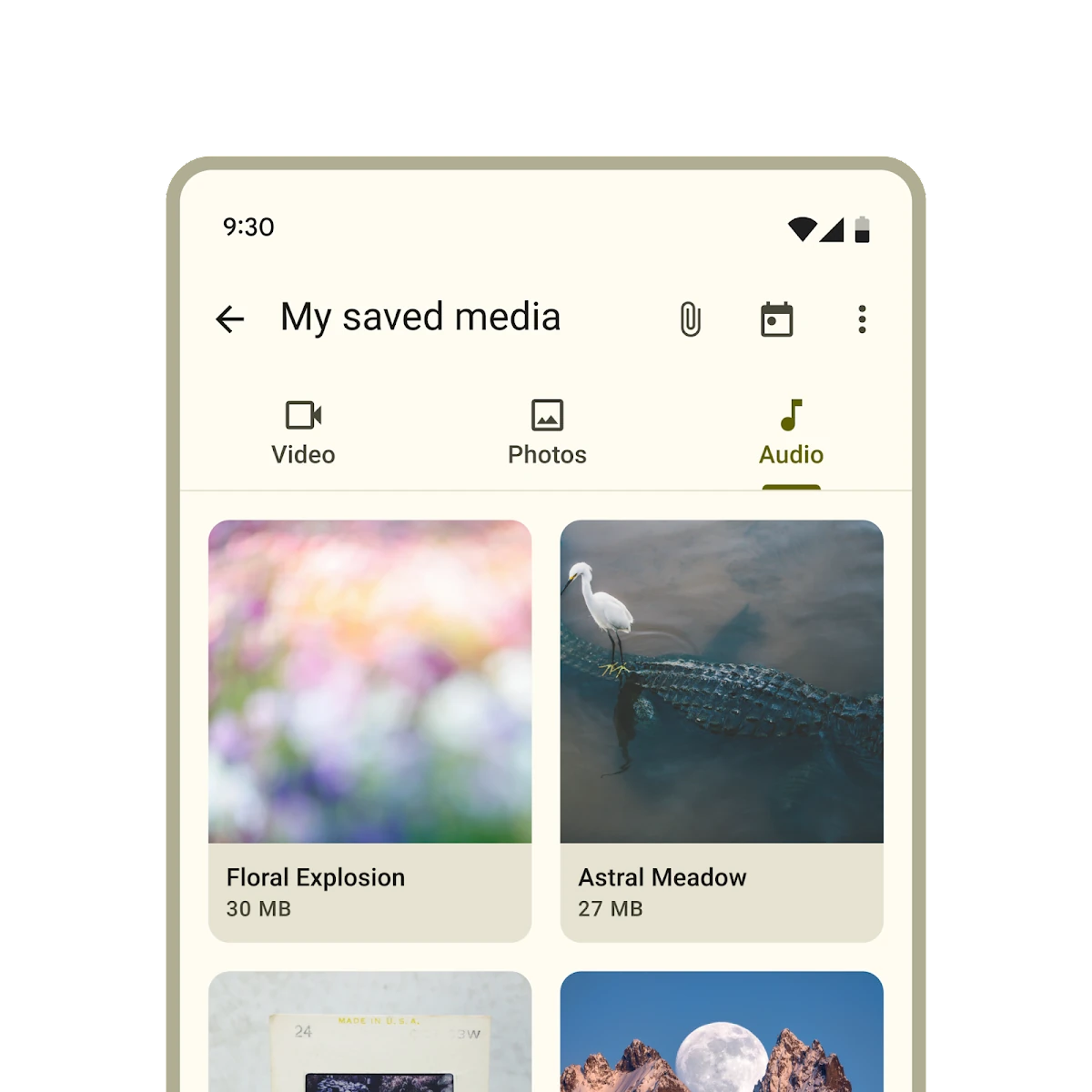
<md-primary-tab>Video</md-primary-tab>
<md-primary-tab>Photos</md-primary-tab>
<md-primary-tab>Audio</md-primary-tab>
</md-tabs>
<md-tabs>
<md-secondary-tab>Birds</md-secondary-tab>
<md-secondary-tab>Cats</md-secondary-tab>
<md-secondary-tab>Dogs</md-secondary-tab>
</md-tabs>Selection
Link to “Selection”Add an active attribute to change which tab is selected.
<md-tabs>
  <md-primary-tab>Video</md-primary-tab>
  <md-primary-tab active>Photos</md-primary-tab>
  <md-primary-tab>Audio</md-primary-tab>
</md-tabs>
To observe changes to tab selections, add an event listener to <md-tabs>, listening for the change event.
tabs.addEventListener('change', (event: Event) => {
  if (event.target.activeTabIndex === 2) {
    // ... perform logic only if index of selected item is 2.
  }
});
Icons
Link to “Icons”Tabs may optionally show an icon.
Icons communicate the type of content within a tab. Icons should be simple and recognizable.
<md-tabs>
  <md-primary-tab>
    <md-icon slot="icon">piano</md-icon>
    Keyboard
  </md-primary-tab>
  <md-primary-tab>
    <md-icon slot="icon">tune</md-icon>
    Guitar
  </md-primary-tab>
</md-tabs>
Tabs may optionally show icons without a label.
<md-tabs>
  <md-primary-tab>
    <md-icon slot="icon">piano</md-icon>
  </md-primary-tab>
  <md-primary-tab>
    <md-icon slot="icon">tune</md-icon>
  </md-primary-tab>
</md-tabs>
Primary tabs
Link to “Primary tabs”Primary tabs are placed at the top of the content pane under a top app bar. They display the main content destinations.
<md-tabs>
  <md-primary-tab>
    <md-icon slot="icon">piano</md-icon>
    Keyboard
  </md-primary-tab>
  <md-primary-tab>
    <md-icon slot="icon">tune</md-icon>
    Guitar
  </md-primary-tab>
</md-tabs>
Inline icons
Link to “Inline icons”Primary tabs can show their icons inline, like secondary tabs.
<md-tabs>
  <md-primary-tab inline-icon>
    <md-icon slot="icon">piano</md-icon>
    Keyboard
  </md-primary-tab>
  <md-primary-tab inline-icon>
    <md-icon slot="icon">tune</md-icon>
    Guitar
  </md-primary-tab>
</md-tabs>
Secondary tabs
Link to “Secondary tabs”Secondary tabs are used within a content area to further separate related content and establish hierarchy.
<md-tabs>
  <md-secondary-tab>
    <md-icon slot="icon">flight</md-icon>
    Travel
  </md-secondary-tab>
  <md-secondary-tab>
    <md-icon slot="icon">hotel</md-icon>
    Hotel
  </md-secondary-tab>
  <md-secondary-tab>
    <md-icon slot="icon">hiking</md-icon>
    Activities
  </md-secondary-tab>
</md-tabs>
Accessibility
Link to “Accessibility”Add an aria-label attribute to <md-tabs> and any individual tab whose label needs to be more descriptive, such as icon-only tabs.
<md-tabs aria-label="Content to view">
  <md-primary-tab aria-label="Photos">
    <md-icon slot="icon">photo</md-icon>
  </md-primary-tab>
  <md-primary-tab aria-label="Videos">
    <md-icon slot="icon">videocam</md-icon>
  </md-primary-tab>
  <md-primary-tab aria-label="Music">
    <md-icon slot="icon">audiotrack</md-icon>
  </md-primary-tab>
</md-tabs>
Tab panels
Link to “Tab panels”Every tab must reference a role="tabpanel" element with aria-controls. Tab panels must be labelled with aria-label or aria-labelledby.
It's common to reference the panel's tab with aria-labelledby.
<md-tabs aria-label="Content to view">
  <md-primary-tab id="photos-tab" aria-controls="photos-panel">
    Photos
  </md-primary-tab>
  <md-primary-tab id="videos-tab" aria-controls="videos-panel">
    Videos
  </md-primary-tab>
  <md-primary-tab id="music-tab" aria-controls="music-panel">
    Music
  </md-primary-tab>
</md-tabs>

<div id="photos-panel" role="tabpanel" aria-labelledby="photos-tab">
  ...
</div>
<div id="videos-panel" role="tabpanel" aria-labelledby="videos-tab" hidden>
  ...
</div>
<div id="music-panel" role="tabpanel" aria-labelledby="music-tab" hidden>
  ...
</div>
Theming
Link to “Theming”Tabs supports Material theming and can be customized in terms of color, typography, and shape.
Primary tab tokens
Link to “Primary tab tokens”| Token | Default value |
|---|---|
--md-primary-tab-container-color | --md-sys-color-surface |
--md-primary-tab-label-text-font | --md-sys-typescale-title-small-font |
--md-primary-tab-active-indicator-color | --md-sys-color-primary |
--md-primary-tab-icon-color | --md-sys-color-on-surface-variant |
--md-primary-tab-container-shape | --md-sys-shape-corner-none |
Primary tab example
Link to “Primary tab example”<style>
:root {
/* System tokens */
--md-sys-color-surface: #f7faf9;
--md-sys-color-primary: #005353;
/* Component tokens */
--md-primary-tab-label-text-font: cursive, system-ui;
--md-primary-tab-label-text-size: 0.8em;
}
</style>
<md-tabs>
<md-primary-tab>Tab 1</md-primary-tab>
<md-primary-tab>Tab 2</md-primary-tab>
<md-primary-tab>Tab 3</md-primary-tab>
</md-tabs>Secondary tab tokens
Link to “Secondary tab tokens”| Token | Default value |
|---|---|
--md-secondary-tab-container-color | --md-sys-color-surface |
--md-secondary-tab-label-text-font | --md-sys-typescale-title-small-font |
--md-secondary-tab-active-indicator-color | --md-sys-color-primary |
--md-secondary-tab-icon-color | --md-sys-color-on-surface-variant |
--md-secondary-tab-container-shape | --md-sys-shape-corner-none |
Secondary tab example
Link to “Secondary tab example”<style>
:root {
/* System tokens */
--md-sys-color-surface: #f7faf9;
--md-sys-color-primary: #005353;
/* Component tokens */
--md-secondary-tab-label-text-font: cursive, system-ui;
--md-secondary-tab-label-text-size: 0.8em;
}
</style>
<md-tabs>
<md-secondary-tab>Tab 1</md-secondary-tab>
<md-secondary-tab>Tab 2</md-secondary-tab>
<md-secondary-tab>Tab 3</md-secondary-tab>
</md-tabs>MdTabs <md-tabs>
Link to “MdTabs <md-tabs>” Properties
Link to “Properties”| Property | Attribute | Type | Default | Description |
|---|---|---|---|---|
autoActivate | auto-activate | boolean | false | Whether or not to automatically select a tab when it is focused. |
activeTabIndex | active-tab-index | number | undefined | |
tabs | Tab[] | undefined | The tabs of this tab bar. | |
activeTab | Tab | undefined |
Methods
Link to “Methods”| Method | Parameters | Returns | Description |
|---|---|---|---|
scrollToTab | tabToScrollTo | Promise<void> | Scrolls the toolbar, if overflowing, to the active tab, or the provided tab. |
Events
Link to “Events”| Event | Type | Bubbles | Composed | Description |
|---|---|---|---|---|
change | Event | Yes | No | Fired when the selected tab changes. The target's activeTabIndex or activeTab provide information about the selection change. The change event is fired when a user interaction like a space/enter key or click cause a selection change. The tab selection based on these actions can be cancelled by calling preventDefault on the triggering keydown or click event. |
MdPrimaryTab <md-primary-tab>
Link to “MdPrimaryTab <md-primary-tab>” Properties
Link to “Properties”| Property | Attribute | Type | Default | Description |
|---|---|---|---|---|
inlineIcon | inline-icon | boolean | false | Whether or not the icon renders inline with label or stacked vertically. |
isTab | md-tab | boolean | true | The attribute md-tab indicates that the element is a tab for the parent element, <md-tabs>. Make sure if you're implementing your own md-tab component that you have an md-tab attribute set. |
active | active | boolean | false | Whether or not the tab is selected. |
hasIcon | has-icon | boolean | false | In SSR, set this to true when an icon is present. |
iconOnly | icon-only | boolean | false | In SSR, set this to true when there is no label and only an icon. |
selected | selected | boolean | undefined |
MdSecondaryTab <md-secondary-tab>
Link to “MdSecondaryTab <md-secondary-tab>” Properties
Link to “Properties”| Property | Attribute | Type | Default | Description |
|---|---|---|---|---|
isTab | md-tab | boolean | true | The attribute md-tab indicates that the element is a tab for the parent element, <md-tabs>. Make sure if you're implementing your own md-tab component that you have an md-tab attribute set. |
active | active | boolean | false | Whether or not the tab is selected. |
hasIcon | has-icon | boolean | false | In SSR, set this to true when an icon is present. |
iconOnly | icon-only | boolean | false | In SSR, set this to true when there is no label and only an icon. |
selected | selected | boolean | undefined |