Switch
Switches toggle the state of an item on or off.

Interactive Demo
Link to “Interactive Demo”View interactive demo inline.
Open interactive demo in new tab.
Usage
Link to “Usage”Switches are similar to checkboxes, and can be unselected or selected.
<md-switch></md-switch>
<md-switch selected></md-switch>
Icons
Link to “Icons”Icons can be used to visually emphasize the switch's selected state. Switches can choose to display both icons or only selected icons.
<md-switch icons></md-switch>
<md-switch icons selected></md-switch>

<md-switch icons show-only-selected-icon></md-switch>
<md-switch icons show-only-selected-icon selected></md-switch>
Label
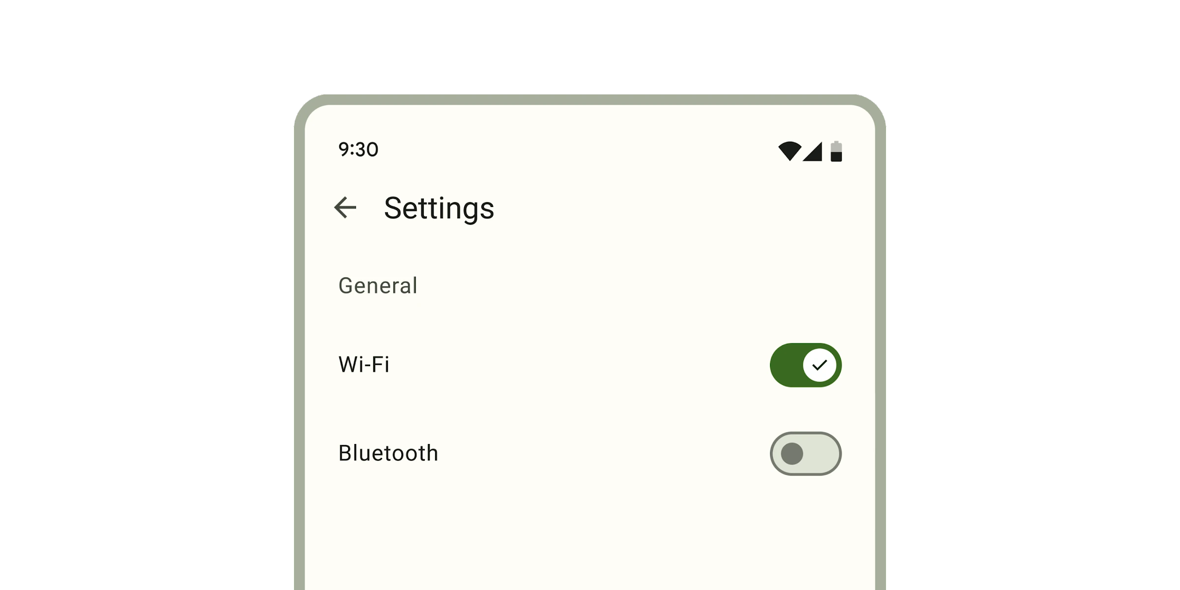
Link to “Label”Associate a label with a switch using the <label> element.
<label>
  Wi-Fi
  <md-switch selected></md-switch>
</label>

<label for="switch">Bluetooth</label>
<md-switch id="switch"></md-switch>
Accessibility
Link to “Accessibility”Add an aria-label attribute to switches without labels or switches whose labels need to be more descriptive.
<md-switch aria-label="Lights"></md-switch>

<label>
  All
  <md-switch aria-label="All notifications"></md-switch>
</label>
bookmark switches are not automatically labelled by <label> elements and always need an aria-label. See b/294081528.
Theming
Link to “Theming”Switches supports Material theming and can be customized in terms of color and shape.
Tokens
Link to “Tokens”| Token | Default value |
|---|---|
--md-switch-handle-color | --md-sys-color-outline |
--md-switch-handle-shape | --md-sys-shape-corner-full |
--md-switch-track-color | --md-sys-color-surface-container-highest |
--md-switch-track-shape | --md-sys-shape-corner-full |
--md-switch-selected-handle-color | --md-sys-color-on-primary |
--md-switch-selected-track-color | --md-sys-color-primary |
Example
Link to “Example”<style>
:root {
/* System tokens */
--md-sys-color-primary: #006a6a;
--md-sys-color-on-primary: #ffffff;
--md-sys-color-outline: #6f7979;
--md-sys-color-surface-container-highest: #dde4e3;
/* Component tokens */
--md-switch-handle-shape: 0px;
--md-switch-track-shape: 0px;
}
</style>
<md-switch></md-switch>
<md-switch selected></md-switch>MdSwitch <md-switch>
Link to “MdSwitch <md-switch>” Properties
Link to “Properties”| Property | Attribute | Type | Default | Description |
|---|---|---|---|---|
selected | selected | boolean | false | Puts the switch in the selected state and sets the form submission value to the value property. |
icons | icons | boolean | false | Shows both the selected and deselected icons. |
showOnlySelectedIcon | show-only-selected-icon | boolean | false | Shows only the selected icon, and not the deselected icon. If true, overrides the behavior of the icons property. |
required | required | boolean | false | When true, require the switch to be selected when participating in form submission. https://developer.mozilla.org/en-US/docs/Web/HTML/Element/input/checkbox#validation |
value | value | string | 'on' | The value associated with this switch on form submission. null is submitted when selected is false. |
disabled | boolean | undefined | ||
name | string | undefined |
Methods
Link to “Methods”| Method | Parameters | Returns | Description |
|---|---|---|---|
formResetCallback | None | void | |
formStateRestoreCallback | state | void |
Events
Link to “Events”| Event | Type | Bubbles | Composed | Description |
|---|---|---|---|---|
input | InputEvent | No | No | Fired whenever selected changes due to user interaction (bubbles and composed). |
change | Event | No | No | Fired whenever selected changes due to user interaction (bubbles). |